Work
Everything here is real and ours
Some of our work.
Always looking for more.
A storefront built end to end, a store redesign for AntibodY, a spec ad for Profound, a community site for a Miami Mahjong club, four reels cut for sound-off feeds, a product animation, a show title animation and three interface designs. Everything here was made by us, and nothing on this page is a concept dressed up as a client; the spec piece says it is one. If you have something you want built, tell us about it.
Brands we have built for




Client work. Always looking to add more.
CardsRG is ours. A collector trading card shop for PSA graded cards, rare inserts and pack rips, built by this studio and still run by it. This is not a case study we were handed. It is the whole job done on ourselves, with our own money on the line.
We built the brand mark, the content engine that grew the audience, the whole storefront, product pages with grade and set detail, cart and checkout. Dark, loud and fast, because that is what the audience responds to. It went live in under two weeks and it sells.
Brand
Mark and palette
Site
Full storefront
Commerce
Cart and checkout
Stack
Next.js on Vercel
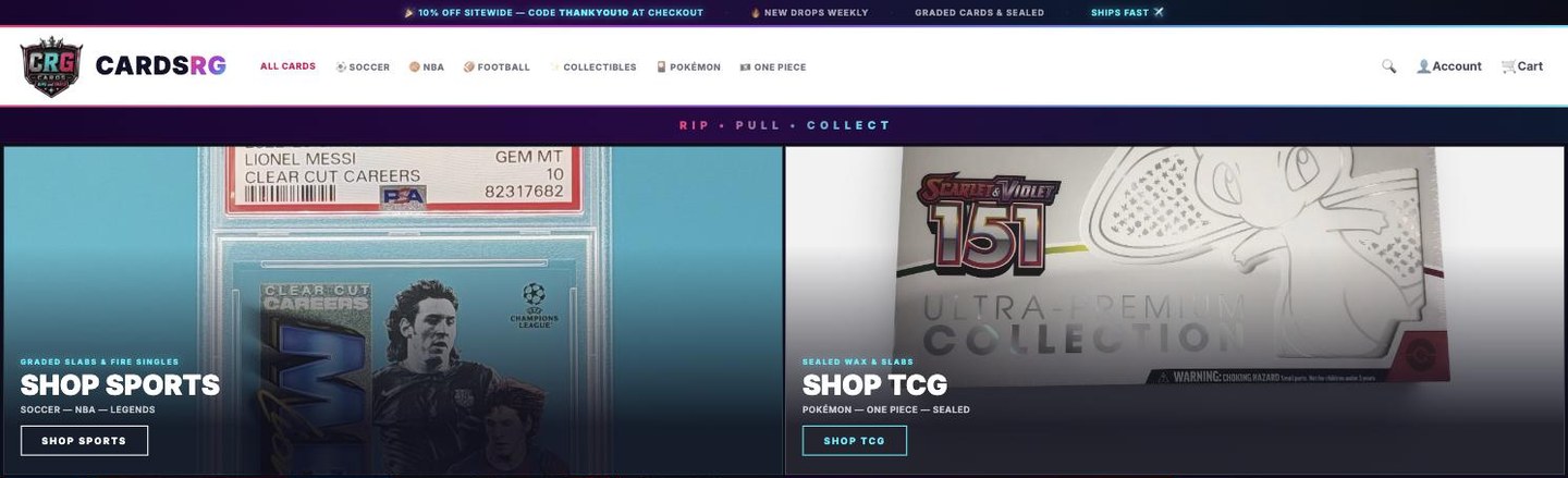
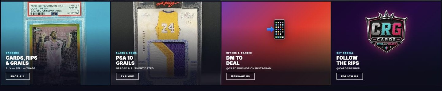
Before and after
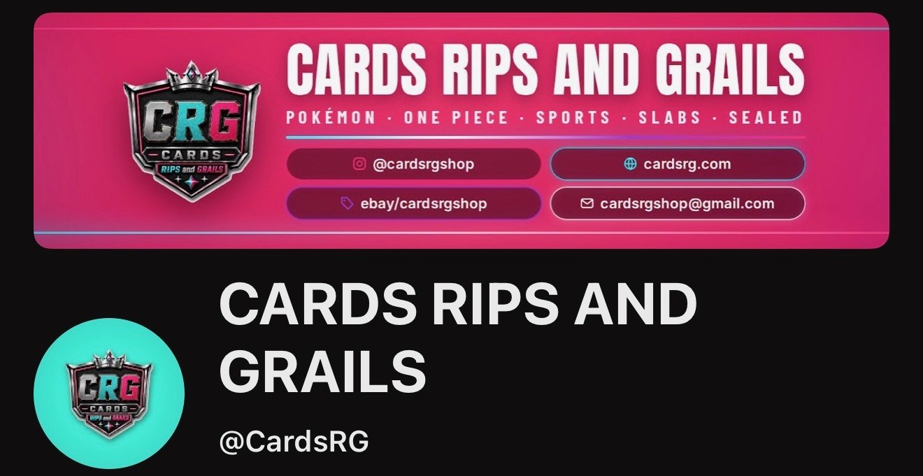
The channel had the audience. It did not have a door.
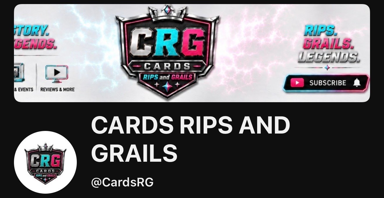
The old banner was a poster. The new one is a directory: what they sell, where to buy it, and the shop address, on the first screen anybody lands on.
What the brand did in 90 days
Instagram Insights · Jul 10 to Oct 7
407,555
Views
103,707
Viewers
13,741
Interactions
+1,162
Net new followers
Daily views
Peak · 37K in one day
Reels
330K views
Posts
46K views
Stories
31K views
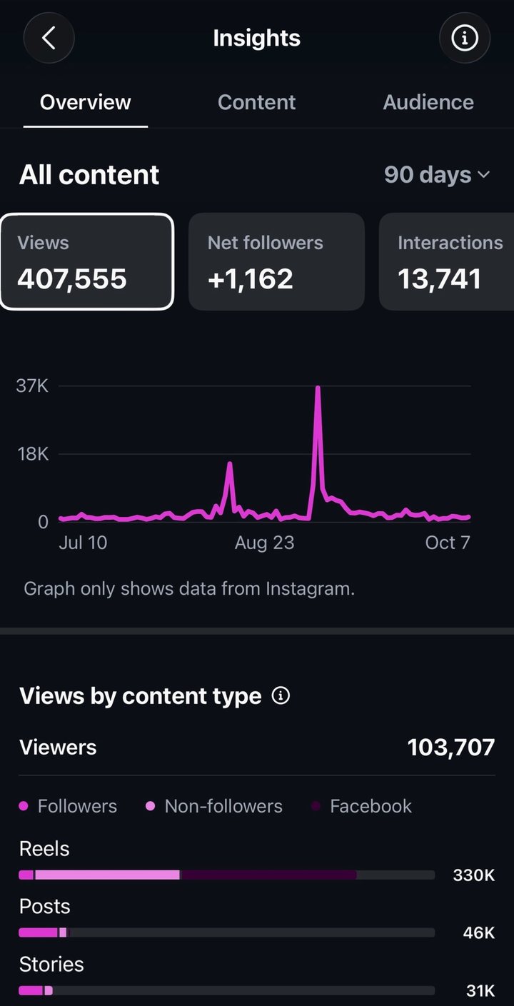
This audience was built post by post, by the same studio that then built the place it points at. Brand, content and storefront are one loop, and these numbers are what the loop produced. That is the argument for hiring us instead of a logo guy and a web guy.
02 · Client store
A store that asks
you a question.
AntibodY is built on one question: what gets you through the hard days? So the whole store reads like a text thread. The brand asks, the shopper answers, and every shirt is somebody's answer.
AntibodY makes tees like “Laughing is my AntibodY”, made with love by healthcare and creative pros in Miami. Their old store was a template. The redesign keeps their logo exactly as it is, goes black and white, and uses only their own photos from the site and Instagram.
It opens on a smiley that draws itself into the spinning AY mark. The shirts pop up when you hover, every button presses like a key, and the bag checks out through their existing Shopify, so all 48 real products and sizes work on day one.
Pieces
Store and brand kit
Catalog
48 products
Checkout
Their Shopify cart
Status
Redesign, in review
03 · Spec ad
A hard problem,
explained in 31 seconds.
Getting AI to produce something is easy. Getting it to do work a marketing team can trust is the hard part, and that is the whole pitch. The ad opens on the easy version, names the hard one, then shows the platform that closes the gap.
Made on our own for Profound, the platform for marketing in AI search. It was not commissioned. It stays inside their look, black with one blue, and lets the type carry the argument: research, planning, creation and measurement snapping into one platform, your judgment on one end and trusted action on the other. It ends where a recruiting ad should, on the careers link.
Length
31 seconds
Format
16:9 landscape
Made for
Recruiting and social
Status
Spec, not commissioned
04 · Client site
Two colors,
one very good table.
A community site has to feel like the room before you walk in. The site is built from the logo alone, its red and its blush and nothing else, so everything the brand puts out looks like the same brand.
Mahj & Coffee teaches American Mahjong in Miami, beginner lessons, guided play, game nights and coffee meetups, the purist way. The site takes the two colors off the logo and refuses a third. The founder's welcome is in her own voice, the buttons carry a coffee cup, the girl with the mug gets a whole band, and the practice sheet from the Etsy shop gets its own room.
Piece
Community site
Palette
Two, from the logo
Site
Single HTML file
City
Miami
05 · Motion
Reels built for
sound-off feeds.
Short vertical pieces that make the whole pitch on screen, in seconds, with no audio needed. They ship alongside a brand or storefront build so the launch does not go out silent.
Client work
Shutters Depot
shutters-depot.com ↗Cut for a hurricane protection company in Hialeah. Twenty-five seconds that walk the product line, accordion shutters, panels and impact windows, with the urgency Miami actually feels every June.
Length
25 seconds
Made for
Instagram and TikTok
Client work
ABC Capital Group
abccapitalgroupusa.com ↗A cash home buyer working Miami-Dade, Broward and Palm Beach. Calm and editorial on purpose, because the audience is somebody under pressure to sell and loud would have read as a scam.
Length
21 seconds
Made for
Instagram and TikTok
Studio sample
Vice City Property Runs
A sample cut in the studio for a South Florida property appointment service. The whole pitch in fourteen seconds: the problem, the coverage, the hours, the handle.
Length
14 seconds
Made for
Instagram and TikTok
Client work
RINGSHIFT
A launch ad for a one-tap mobile ring game coming to the App Store. Real gameplay under big captions that read in a glance: the challenge, the rule, the speed, then the download.
Length
17 seconds
Made for
App install ads
06 · Product animation
Explaining the thing
the screenshot cannot.
Some products only make sense in motion. Twelve seconds showing the actual mechanic beats a paragraph trying to describe it, and it works on a landing page, in an ad and in a pitch deck without being recut.
SlipFolio turns a bet slip into an investment: a slice of every stake goes into a portfolio, win or lose. That is one sentence to read and a hard idea to picture, so the animation shows it happening on the slip itself, then lands the line.
Length
12 seconds
Format
16:9 landscape
Made for
Site and ads
Audio
None needed
07 · Title animation
The first few seconds
set the whole tone.
A show open has one job: make the name land before the host says a word. This one types itself in letter by letter over a live waveform, so the format is clear before the title finishes.
Studio sample
Powered by People
An intro built in the studio for a talk format about the people behind the work. Sans for the power, italic serif for the people, and a waveform that keeps moving so the card never sits still. Then the tagline types in under it, so viewers know what the show is about before anyone speaks. It drops in front of any episode, podcast or video, without a recut.
Length
14 seconds
Format
16:9 landscape
Made for
Podcast and video opens
Audio
Add the theme
08 · Interface design
The screen doing
all of the selling.
A landing page and a first app screen have the same job. Say what the thing is, say why it is worth a minute, and leave one obvious next move. These three are studio design work, drawn to be handed to a build and shipped without a second pass.
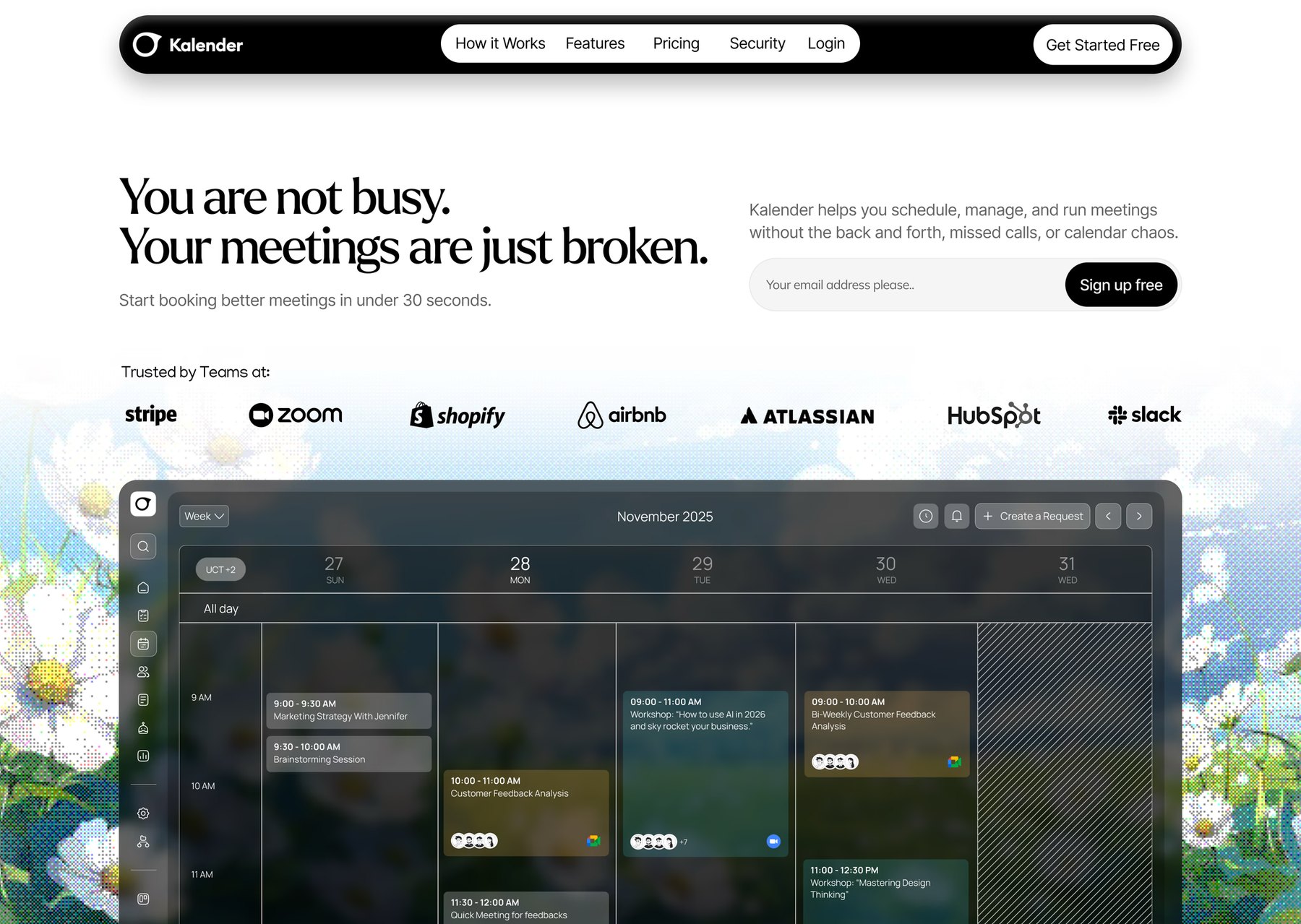
Studio design
Kalender
A scheduling tool sells on one promise, so the page leads with the objection instead of the feature list. The headline names the problem, the sign-up sits at eye level next to it, and the product itself carries the rest of the screen. The calendar is shown running, not described.
Piece
Landing page
Screens
One, above the fold
Type
Serif headline, grotesk UI
Made for
Sign-ups
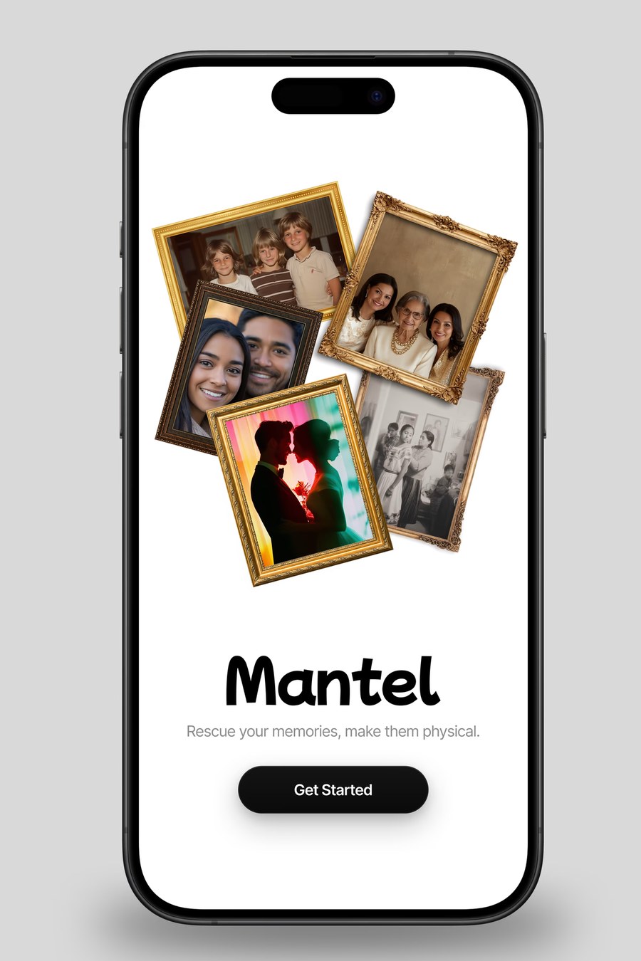
Studio design
Mantel
The first screen of an app has one job, and it is not onboarding. The framed photos say what the product makes before the wordmark says its name, so the line underneath only has to confirm it. One button, no account wall.
Piece
Mobile app screen
Format
Phone, first run
Actions
One
Made for
The App Store shot
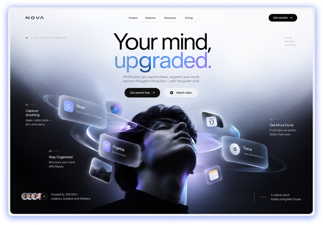
Studio design
NOVA
Every AI product page opens the same way, with a gradient and a promise about productivity. This one puts a person at the center and lets the features orbit them, so the thing being upgraded is obvious before a word is read. The headline splits across two weights to do the same job in three words.
Dark, but not heavy. The glow sits behind the subject rather than on the type, which keeps the copy legible and stops the page looking like every other launch in the category.
Piece
Landing page
Screens
One, above the fold
Type
Grotesk, two weights
Made for
Product launch
Walk through one decision at a time
Anyone can show you
a finished logo.
The finished thing tells you almost nothing. What decided it is the part worth reading, so here is the CRG mark taken apart, one choice at a time, including the ones we got wrong first.
The mark in the place it actually has to work: small, in a corner, next to a menu, on top of a photograph. That is the real test, not a presentation slide.
01
A shield, because the category already speaks it
Trading cards live inside sports crests, team badges and holo foil. A shield is not a clever idea, it is the shape the audience already reads as authority, and using the language your buyer already speaks beats being original at them.
02
Two accents, not five
Teal and magenta, and nothing else fighting them. Card culture is visually loud, so the mark had to hold its own against a photo of forty foil packs without joining the noise. Two colors far apart on the wheel do that. Five would have turned into mush at the size it actually gets used.
03
The crown earns its place
It is not decoration. The business is built on grails, the one card everyone is chasing, so the crown is the promise restated at the top of the mark. Every element should be answering a question about the business. If it is only there because it looked good, it comes out.
04
Chrome that survives being shrunk
The bevel and the inner glow read as premium at full size, but the mark spends its life at forty pixels in a browser tab. So the silhouette had to work in one flat color first, and the shine got added on top. Build it the other way around and you get a logo that dies the moment it is small.
05
The subline does the explaining
RIPS and GRAILS sits under the shield so the mark never has to explain itself. Three letters cannot tell a first-time visitor what the business does. Two words can, and they can be dropped when the audience knows you.
And the one we got wrong first
The thumbnail that did not work.
Version one: two people behind a pile of packs against a bright sky. It looked fine and it performed badly, which is the most useful kind of failure because it is specific.
What was wrong
Half the frame was empty sky. On a phone, at the size a thumbnail is actually seen, the faces were smaller than a fingernail and the product was an unreadable smear along the bottom.
What changed
Faces scaled up until they carry the frame, product pushed into every remaining gap so the density itself is the message, sky deleted entirely. Same two people, same packs, same shoot. Only the decisions changed.
The rule underneath it
Design for the size it gets viewed at, not the size you are working at. Almost every weak thumbnail, logo and hero image is a thing that was judged on a big screen and lives on a small one.
This is the level every decision gets, on every build, whether or not anybody ever asks. You are welcome to ask.
The Honest Bit
New studio.
Not a new obsession.
FlowZone is new. The thing it is built on is not. Brand, design and the way a company sounds have been the obsession for years, long before any of it had a name or an invoice attached. This page is short because the studio is at the beginning, not because the work is a side interest we picked up recently.
It also means everything here is real. No concepts dressed up as clients, no logos we had nothing to do with. And what you get for arriving early is the version of a studio everyone says they want later: the person who answers your email is the person who builds the thing, and the pricing reflects where we are rather than where we intend to be.
Four questions. No call. You see your number before anything starts.
Want to be the next one on this page?
Four questions. No call. You see your number before anything starts.